
绚丽的css3动画效果
2016-9-8:添加firefox支持。
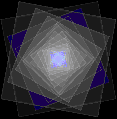
绚丽的HTML5 CSS动画效果,请使用webkit内核的浏览器,如chrome运行示例。chrome运行后效果如下图所示
源代码如下
<style>
    body {
        background: black;
        width:100%;height:100%;overflow:hidden;
        position: relative;
    }

    .effect-wrapper {
        width: 400px;
        height: 400px;
        position:absolute;left:50%;top:50%;margin-left:-200px;margin-top:-200px;
    }

        .effect-wrapper .layer1,
        .effect-wrapper .layer2 {
            position: absolute;
            top: 0px;
            left: 0px;
            width: 100%;
            height: 100%;
        }

            .effect-wrapper .layer1,
            .effect-wrapper .layer1 * {
                background: rgba(0,0,255,.1);
                border-radius:10px;
            }

            .effect-wrapper .layer2,
            .effect-wrapper .layer2 * {
                background: rgba(0,0,0,.1);
                /*border-radius:10px;*/
            }

                .effect-wrapper .layer1 *,
                .effect-wrapper .layer2 * {
                   position:absolute;left:10%;top:10%;
                    width: 80%;
                    height: 80%;
                    -moz-box-sizing:border-box;
                }


            /* --------- Animation --------- */
           .effect-wrapper .layer1,
            .effect-wrapper .layer1 * {
                -webkit-animation-name: spin-clockwise;
                -moz-animation-name: spin-clockwise;
                -webkit-animation-duration: 50s;
                -moz-animation-duration: 50s;
                -webkit-animation-iteration-count: infinite;
                -moz-animation-iteration-count: infinite;
                -webkit-animation-timing-function: cubic-bezier(0.82, 0.24, 0.25, 0.75);
                -moz-animation-timing-function: cubic-bezier(0.82, 0.24, 0.25, 0.75);
                -webkit-box-shadow: inset 0 0 10px rgba(255,255,255,0.3);
                -moz-box-shadow: inset 0 0 10px rgba(255,255,255,0.3);
                box-shadow: inset 0 0 10px rgba(255,255,255,0.3);
            }

            .effect-wrapper .layer2,
            .effect-wrapper .layer2 * {
                -webkit-animation-name: spin-counter-clockwise, pulsate-blue;
                -moz-animation-name: spin-counter-clockwise, pulsate-blue;
                -webkit-animation-duration: 50s;
                -moz-animation-duration: 50s;
                -webkit-animation-iteration-count: infinite;
                -moz-animation-iteration-count: infinite;
                -webkit-animation-timing-function: cubic-bezier(0.82, 0.24, 0.25, 0.75);
                -moz-animation-timing-function: cubic-bezier(0.82, 0.24, 0.25, 0.75);
                -webkit-box-shadow: inset 0 0 10px rgba(255,255,255,0.3);
                -moz-box-shadow: inset 0 0 10px rgba(255,255,255,0.3);
                box-shadow: inset 0 0 10px rgba(255,255,255,0.3);
            }

    /* Animation: Clockwise */
    @-webkit-keyframes spin-clockwise {
        0% {
            -webkit-transform: rotate(0deg);
        }

        100% {
            -webkit-transform: rotate(360deg);
        }
    }
    @-moz-keyframes spin-clockwise {
        0% {
            -moz-transform: rotate(0deg);
        }

        100% {
            -moz-transform: rotate(360deg);
        }
    }

    /* Animation: Counter counter clockwise */
    @-webkit-keyframes spin-counter-clockwise {
        0% {
            -webkit-transform: rotate(0deg);
        }

        100% {
            -webkit-transform: rotate(-360deg);
        }
    }
    @-moz-keyframes spin-counter-clockwise {
        0% {
            -moz-transform: rotate(0deg);
        }

        100% {
            -moz-transform: rotate(-360deg);
        }
    }


    /* Animation: Counter counter clockwise */
    @-webkit-keyframes pulsate-blue {
        0% {
            background: rgba(0,0,255,.1);
            -webkit-transform: /* Add Cool stuff here! */;
        }

        100% {
            background: rgba(255,255,255,.1);
            -webkit-transform: /* Add Cool stuff here! */;
        }
    }
    @-moz-keyframes pulsate-blue {
        0% {
            background: rgba(0,0,255,.1);
            -moz-transform: /* Add Cool stuff here! */;
        }

        100% {
            background: rgba(255,255,255,.1);
            -moz-transform: /* Add Cool stuff here! */;
        }
    }
</style>
<div class="effect-wrapper">

    <div class="layer1">
        <div>
            <div>
                <div>
                    <div>
                        <div>
                            <div>
                                <div>
                                    <div>
                                        <div>
                                            <div>
                                                <div>
                                                    <div></div>
                                                </div>
                                            </div>
                                        </div>
                                    </div>
                                </div>
                            </div>
                        </div>
                    </div>
                </div>
            </div>
        </div>
    </div>

    <div class="layer2">
        <div>
            <div>
                <div>
                    <div>
                        <div>
                            <div>
                                <div>
                                    <div>
                                        <div>
                                            <div>
                                                <div>
                                                    <div></div>
                                                </div>
                                            </div>
                                        </div>
                                    </div>
                                </div>
                            </div>
                        </div>
                    </div>
                </div>
            </div>
        </div>
    </div>

</div>
来源:http://codepen.io/peterwestendorp/pen/wGECk
加支付宝好友偷能量挖...