
js技能冷却效果
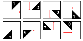
玩游戏的都知道技能有一个冷却效果,效果如下图。在网页里,除了用Flash,通过css+javascript等不少方法可以实现它。

显然这种效果不复杂,一张背景图片,加上前面带有透明度的多边形图层,在脚本控制下就可以转起来了。但问题在于用什么方法来构建这个多边形?
在IE下可以用VML,其他浏览器可以用Canvas等等。虽然行的通,但都不是最简单的。仔细分析下,该效果本质就是若干个三角形拼接而成。而三角形,如果你熟悉CSS2的话,一定在哪个地方见过。。。
首先来看一个100*100尺寸的div,他有4条彩色的边框:
当然,此时你看不出什么。现在我们把div的边框宽度设置成50px:
你发现什么了?边框与边框之间的交界处正好是条斜线。现在我们把div的长宽都设置成0,并且试着改变每条边的边框宽度:
复制代码
<style>
.demo3
{
    width: 0px;
    height: 0px;
    overflow: hidden;
    border-top: 20px red solid;
    border-right: 30px green solid;
    border-bottom: 40px blue solid;
    border-left: 50px #000 solid;
}
</style>
<div class="demo3"></div>
我们对其上右下左分别设置了20 30 40 50px的边框宽度,这时就是呈现出一个不规则的三角形了。我们还可以通过设置边框颜色为transparent,让指定的边框隐藏掉(只指定一个方向上 单独的边框是不会显示出来的,至少要指定两个相连的方向才能显示出来,所以要把不该出现的方向上的设置成透明)。例如:
<style>
.demo4
{
    width: 0px;
    height: 0px;
    overflow: hidden;
    border-left: 50px #000 solid;
    border-top: 20px red solid;
    border-right: 0px green solid;
    border-bottom: 0px blue solid;
}
</style>
<div class="demo4"></div>
但是我们只需其中一种颜色,所以要把另个边框的颜色设置成透明。值得注意的是,IE6下边框颜色不支持transparent值,始终显示为黑色,所以需要用个hack针对ie6,用chroma滤镜过滤掉黑色。(这一点感谢CSDN上的网友X!ao_f的支持!)
<style>
.BG5
{
    background: #CC9900;
}
.demo5
{
    width: 0px;
    height: 0px;
    overflow: hidden;
    filter: alpha(opacity=60);
    _filter: Chroma(color='black') alpha(opacity=60);
    opacity: 0.6;
    border-left: 50px #000 solid;
    border-top: 20px transparent solid;
    border-right: 0px green solid;
    border-bottom: 0px blue solid;
}
</style>
<div class="BG5">
        <div class="demo5"></div>
</div>
如此一来,我们只需创建若干个div,通过设置其边框来拼接成相应的多边形。
事实上我们可以利用边框两边的三角形,这样只需创建4个遮罩层。至于代码如何写,拿张草稿纸出来,在上面推算下就可以了。
源代码如下
<!DOCTYPE html PUBLIC "-//W3C//DTD XHTML 1.0 Transitional//EN" "http://www.w3.org/TR/xhtml1/DTD/xhtml1-transitional.dtd">
<html xmlns="http://www.w3.org/1999/xhtml">
<head>
<meta http-equiv="Content-Type" content="text/html; charset=utf-8" />
<title>WarICON Prefect</title>
<base href="http://www.etherdream.com/funnyscript/WarIcon/" />
<style>
.icoBox
{
	position: absolute;
	overflow: hidden;
	width: 64px;
	height: 64px;
	background: #000;
}

.icoBox *
{
	margin: 0;
	position: absolute;
}

.icoBox .mask
{
	display: none;
	overflow: hidden;
	border: 33px solid #000001;

	filter: Chroma(color='black') alpha(opacity=60);
	-moz-opacity: 0.6;
	-khtml-opacity: 0.6;
	opacity: 0.6;
}

.icoBox .layer0
{
	height: 0px;
	left: 33px;
	top: -33px;

	border-top: 33px solid transparent;
	border-left: 0px solid transparent;
}

.icoBox .layer1
{
	width: 0px;
	left: 33px;
	top: 33px;

	border-top: 0px solid transparent;
	border-right: 33px solid transparent;
}

.icoBox .layer2
{
	left:-33px;
	top: 33px;

	border-bottom: 33px solid transparent;
	border-right: 0px solid transparent;
}

.icoBox .layer3
{
	left: -33px;
	top: -33px;

	border-bottom: 0px solid transparent;
	border-left: 33px solid transparent;
}
</style>
</head>

<body ondragstart="return false">
<div id="divBox" class="icoBox" style="left:10px; top:10px;">
	<img id="divBGPic" class="icoBGPic" src="Icon1.PNG" onmousedown="handleMouseDown()" />
</div>

<script>
    var $c = function (v) { return document.createElement(v) }


    var __VER__ = navigator.userAgent;
    var __FF__ = /Firefox/.test(__VER__);

    if (__FF__) {
        CSSStyleDeclaration.prototype.__defineSetter__("pixelHeight", function (v) { this.height = v + "px"; });
        CSSStyleDeclaration.prototype.__defineSetter__("pixelWidth", function (v) { this.width = v + "px"; });
        CSSStyleDeclaration.prototype.__defineSetter__("pixelTop", function (v) { this.top = v + "px"; });
        CSSStyleDeclaration.prototype.__defineSetter__("pixelLeft", function (v) { this.left = v + "px"; });
    }

    try { document.execCommand("BackgroundImageCache", false, true) } catch (e) { }
</script>


<script>
    var styPic = document.getElementById("divBGPic").style;
    var arrMask = [];
    var tickID;
    var stage;
    var inCD;


    window.onload = function () {
        var i, obj;

        for (i = 0; i < 4; i++) {
            obj = $c("div");
            obj.className = "mask layer" + i;
            arrMask[i] = obj.style;

            document.getElementById("divBox").appendChild(obj);
        }
    };


    function handleMouseDown() {
        styPic.pixelLeft = 2;
        styPic.pixelTop = 2;
        styPic.pixelWidth = 60;
        styPic.pixelHeight = 60;
    }


    document.onmouseup = function (e) {
        styPic.pixelLeft = 0;
        styPic.pixelTop = 0;
        styPic.pixelWidth = 64;
        styPic.pixelHeight = 64;

        e = e || event;
        e = e.srcElement || e.target;

        if (e != document.getElementById("divBGPic"))
            return;

        if (inCD)
            return;
        inCD = true;

        tickID = 0;
        stage = 0;
        Reset();
    };


    function Draw() {
        if (!inCD)
            return;

        var i = ++tickID;

        switch (stage) {
            case 0:
                arrMask[0].borderLeftWidth = i + "px";
                break;
            case 1:
                arrMask[0].pixelHeight = i;
                arrMask[0].borderBottomWidth = (33 - i) + "px";
                break;
            case 2:
                arrMask[1].borderTopWidth = i + "px";
                break;
            case 3:
                arrMask[1].pixelWidth = i;
                arrMask[1].borderLeftWidth = (33 - i) + "px";
                break;
            case 4:
                arrMask[2].pixelWidth = 33 - i;
                arrMask[2].borderRightWidth = i + "px";
                break;
            case 5:
                arrMask[2].pixelHeight = i;
                arrMask[2].borderTopWidth = (33 - i) + "px";
                break;
            case 6:
                arrMask[3].pixelHeight = 33 - i;
                arrMask[3].borderBottomWidth = i + "px";
                break;
            case 7:
                arrMask[3].pixelWidth = i;
                arrMask[3].borderRightWidth = (33 - i) + "px";
                break;
            case 8:
                inCD = false;
                for (i = 0; i < 4; i++)
                    arrMask[i].display = "none";
                break;
        }

        if (tickID == 33) {
            tickID = 0;
            stage++;
        }
    }

    function Reset() {
        for (var i = 0; i < 4; i++) {
            arrMask[i].display = "block";
        }

        arrMask[0].pixelWidth = 0;
        arrMask[0].pixelHeight = 0;
        arrMask[0].borderLeftWidth = "0";
        arrMask[0].borderBottomWidth = "33px";


        arrMask[1].pixelWidth = 0;
        arrMask[1].pixelHeight = 0;
        arrMask[1].borderTopWidth = "0";
        arrMask[1].borderLeftWidth = "33px";


        arrMask[2].pixelWidth = 33;
        arrMask[2].pixelHeight = 0;
        arrMask[2].borderRightWidth = "0";
        arrMask[2].borderTopWidth = "33px";

        arrMask[3].pixelWidth = 0;
        arrMask[3].pixelHeight = 33;
        arrMask[3].borderBottomWidth = "0";
        arrMask[3].borderRightWidth = "33px";
    }


    function RenderRoutine() { Draw(); }

    var timer = setInterval(RenderRoutine, 16);
</script>
</body>
</html>
来源:http://www.cnblogs.com/index-html/archive/2011/03/11/css_skill_cd.html
加支付宝好友偷能量挖...